Guides
How to Add and Customize the Simple Selector with Props
How to Add and Customize the Simple Selector with Props
Once you have translated your text and are satisfied with the results, it is time to publish your changes and configure the look of your language selector.
Apply Translations and Choose the Basic Selector
Go to the main dashboard of the plugin and click the Apply Translations button. You will be presented with two options — for this guide, choose Basic. Click Launch, then select Basic.
On the next screen, you can choose exactly which pages or CMS collections you want to update. This depends on where you have added translations. Once you click Apply, FrameLoc will automatically add the Simple Selector component to the canvas of every page you selected.
Note: If you want to use the Simple Selector inside your website's Navigation Bar, it works perfectly. However, you will need to manually delete the Simple Selector that FrameLoc placed on the canvas of each page, and instead place the component directly inside your Navigation Bar component.
Configuring the Component
Now that the Simple Selector is on your pages, you can customize its props directly on a page-by-page basis.
Note: If you do not want to configure the settings for the Simple Selector over and over again for every single page, there is a simple solution. Create a new Component, place the Simple Selector inside it, and then place this wrapper component on all your pages. This way, your configuration is centralized — any change you make to the wrapper will instantly update the selector on every page.
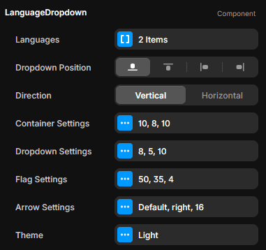
The Languages Prop
In the Languages prop, you will see the list of languages you added in FrameLoc. Ideally, these are added automatically. If they are not, you can add them manually here. Be careful to use the exact ISO codes for each language, as this is what the system uses to switch translations correctly.
Dropdown Position and Direction
The Dropdown Position prop controls where the language list appears when the user clicks the selector. You can choose to have it open to the right, top, bottom, or left of the trigger button.
Below that, the Direction prop lets you decide if the list of languages should be displayed vertically (a standard list) or horizontally.
Styling and Design Settings
The Simple Selector offers deep customization options to match your site's design:
Container Settings: Adjust gaps, border radius, padding, box shadows, and the open/close animation.
Dropdown Settings: Fine-tune the gap, spacing, and padding within the dropdown list.
Flag Settings: Control the width, height, and border radius of the flag icons.
Arrow Settings: Choose whether to use a custom arrow icon for the dropdown.
Theme: Toggle between Light and Dark modes to fit your color scheme.
As you can see, the Simple Selector is completely customizable, allowing you to tailor every aspect of the component via these configurable props.